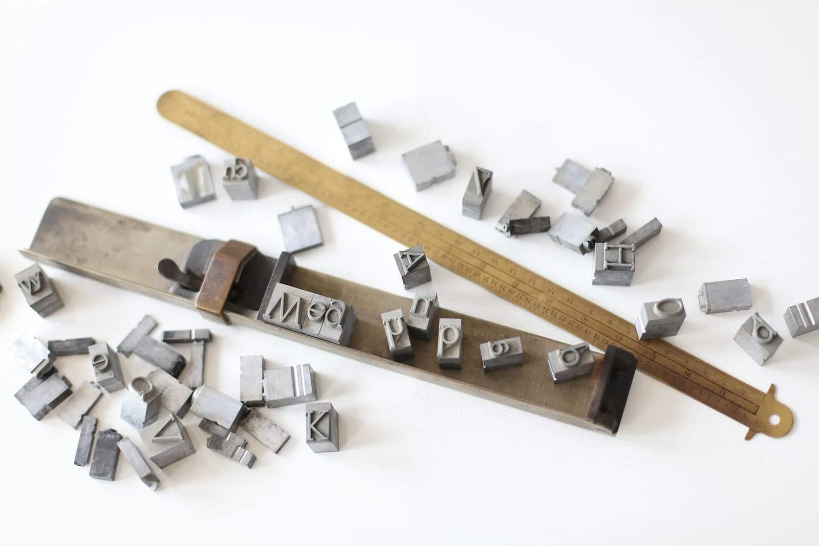
Quotation:
“It won’t always look good, but experimenting is an important part of every design!”
Typography simply explained, is the art of arranging and designing the written word. It is the embodiment of the visual language and the most important part of web design because we communicate with readers through websites. From larger headlines and bold blocks to small bodies.
Headlines
Headlines are one of the most important elements on the website and often the starting point of the entire design. There are some techniques to help you understand the basics of good-looking headlines.
1. One Big Line, One Small Line
This is the most typical basic trick. One of your most powerful tools for creating headlines is contrast and in this example, it is mainly in the form of the font size. The key here is to place the emphasis where you think it belongs. In this example, “Great Headline” is the main idea and is always emphasized whether it’s on the top or on the bottom.
2. Emphasized words
The same basic logic as in the first example above. We simply use size as a major point of contrast. There’s no magic formula for choosing which words should be made larger. I make words not conveying the message, such as modifiers and conjunctions, smaller, and enlarge the important ones. Every sentence or slogan can be written in a few words. In print ads, this is one of the most used tricks for headlines, always trying to grab someone’s attention to most important parts.
3. All Caps
All caps looks good in short headlines but is hard to be read in paragraphs or long sentences. On various websites, I’ve seen mainly quotations in the interview articles written in all caps. Journalists love all caps and use it as a typographic special effect. So be careful how you use all caps. Sometimes, underlining all caps is used to make more emphasized headline.
4. Double message
This one should be used in rare cases but it’s pretty fun. You can use size, weight, typeface or color to highlight specific letters of the line. The result is a cleverly hidden message in your headline. In the headlines above, you can see “DUH!” and “WOW”. These are very simple examples, it’s more impressive when you really spend some time to make the two meanings work well together. For example – the last line.
5. Uppercase and lowercase
In the examples on the left side various combinations of uppercase, lowercase and small caps text are used. Typically, the uppercase letters are used for emphasis but it’s nice to combine them with lowercase line. Combination of lowercase with uppercase are usually used in western, but don’t be afraid to use them in another topic.
6. The same line width
The result achieved in the left picture is non-typical. You usually see this technique used in a bold condensed sans-serif like Helvetica but don’t fall into the trap of doing what everyone else does and try it with any font you want. It won’t always look good, but experimenting is an important part of every design! The font used here is DeLarge Bold, which is difficult to read but quite attractive in small amounts. Plus, you know, it just looks cool. Want to implement this technique in the live text on the web? There are a few jQuery plugins making it easy, such as Lettering.js and BigText.
7. UPPERCASE AND LOWERCASE
This headline design is very common in magazines. Basically, you type something out in the title case and watch the negative space formed, in our example, between the two “ds”. It’s often a perfect place to put a word or two in. The result is a nicely integrated headline that only takes two seconds to build! Perfect for all those times when you need to catch your deadline.
(Source: http://designshack.net/articles/typography/7-quick-and-easy-to-jazz-up-your-headline-typography/)


