UI/UX
WBP Online app
Mobile app for traders
Client
WBP Online
Role
UX / UI Designer
Industry
Finance
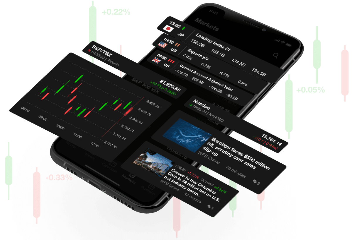
WBP Online mobile application was developed for traders with the aim of producing the most practical and user-friendly data application on the market. The app gives brokers and forex traders all the real-time information they need to keep their finger on the pulse of financial market.
Results and outcomes
- App was downloaded by more than 120 000 users with 4.5 star average rating in the Google play and App store
- Increased awareness and searchability of the WBP Online brand among traders by 200%
Problem statement
Traders need on-the-go news for all things financial, business, economic and political related to their everyday trading needs. They need especially on news that directly relates to forex and commodities trading.
Goals
- Increased awareness and searchability of the WBP Online brand between traders
- Create simple application that traders will like to use

My design process
I start with research to understand users. I create personas, brainstorm, make wireframes and prototypes, test with users, and gather feedback. This ensures my designs are easy and enjoyable to use.
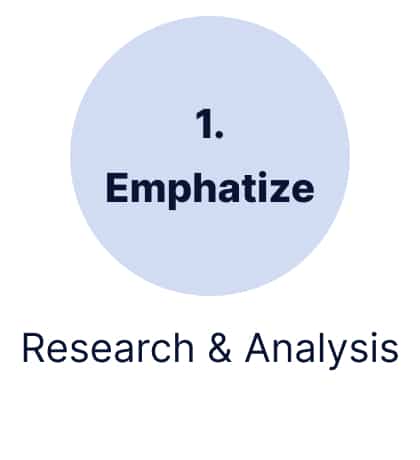
Emphatize
Research & Analysis
The first steps were Interview users (Traders) and stakeholders (Project manager, Programmers, Marketers and CEO).
Users need on-the-go news for all things financial, business, economic and political related to their everyday trading needs. They need especially news that directly relates to forex, and commodities trading, and also they want to have to invest immediately when the opportunity is there.
Stakeholders see in this app business opportunity. They are considering between adding ads to the app and earning money from transactions.
Below you can see insights written into stickies from both of these interviews.

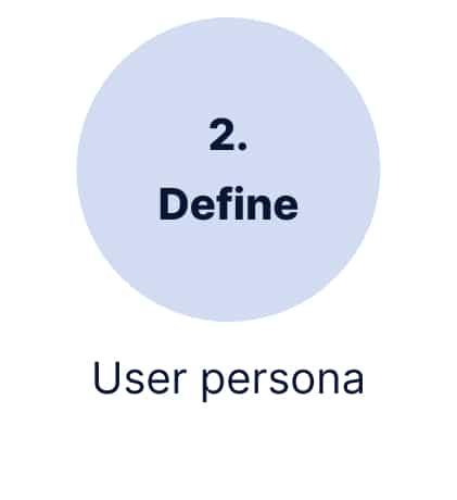
Define
User persona
Through our user research - user interviews, we got valuable information about our users. They are mostly businessmen from India, Pakistan, and Indonesia. They want to earn more money by investing in the world’s markets on the go.

IDEATE
User flows
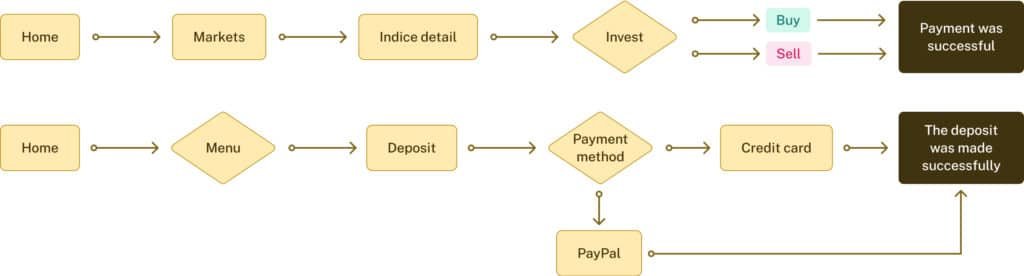
We created a step-by-step process a web visitor takes to reach their desired goal. We assessed issues or gaps that can be redesigned and optimized, thereby allowing user goals to be reached quicker and more efficiently.
Prototype
Concepts & Wireframes
Based on our user interviews we created the first wireframes with the cooperation of stakeholders. We decided, that we will test these wireframes on our stakeholders and after we will finish MVP (minimum valuable product) we will test on users the real app. Because our users don't understand the idea of wireframes, prototypes and it's easier to get feedback from them from a real application.
Prototype
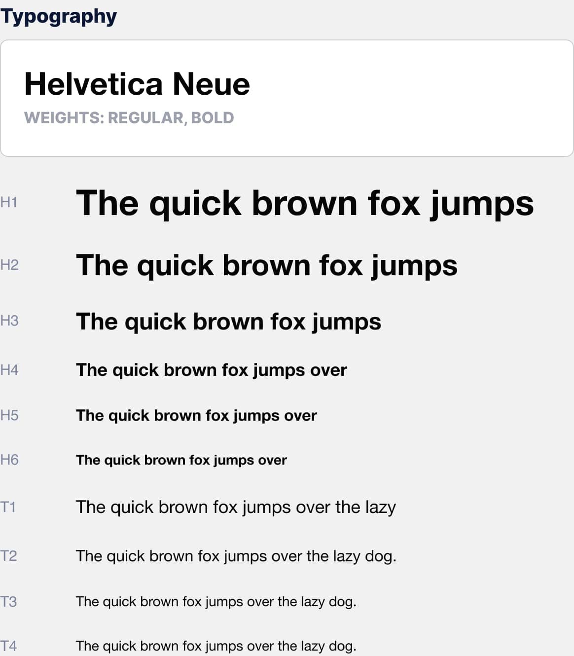
Style guide & Visual design
The next plan of action was to create color palettes and typography that would help communicate the brand’s identity and also give the product a professional and elegant feel.


Prototype
Clickable prototype
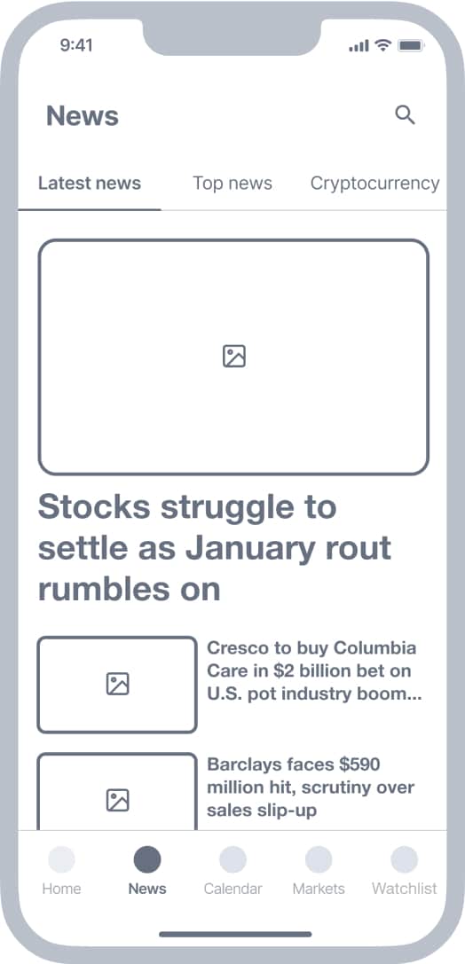
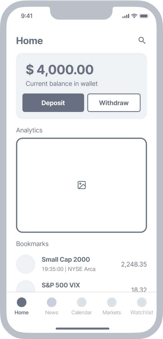
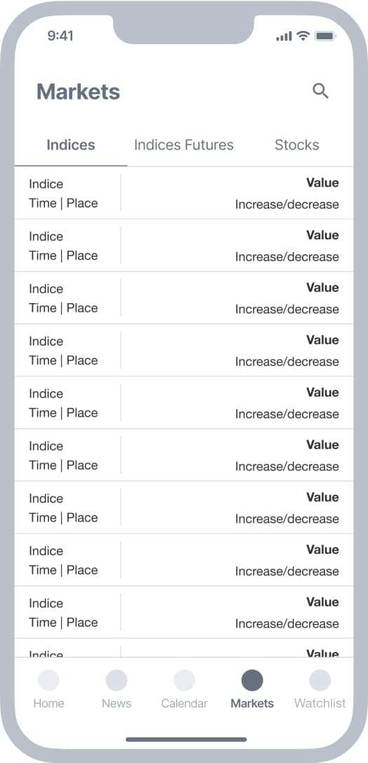
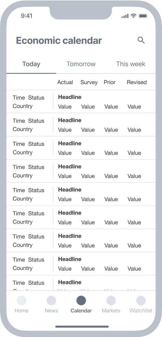
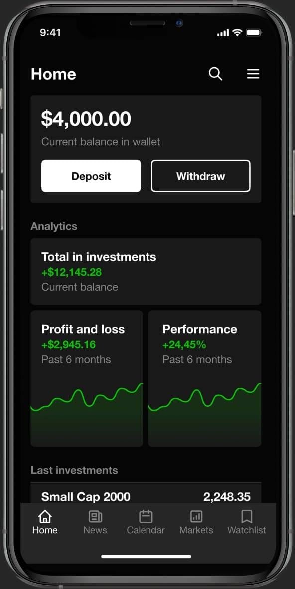
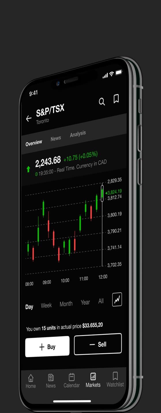
In the prototype are included a registration process, dashboard, news, calendar, markets indices, watchlist, investing process, deposit, withdraw, and settings. The prototype is created in Figma and you can find the link below.
Show prototypeTest
Validation, Usability, Feedback
After we finished MVP we looked closer at the user's feedback. We received really nice feedback and also bad feedback about security issues, nonfunction parts of the app, missing features, and so on.
So we heard to our users and we improved our application step by step to more closely aligned with a real user's needs and goals.

Pretty convenient app
It’s so handful and simple app with great quality within it. What a great app!

Erdem Raisani
Great app and calendar
The calendar and information are as good as ever I’ve seen. Perfect overview of the market.

Balash Farooqi
Challenges & Conclusion
We chose the approach, that we firstly build MVP in cooperation with stakeholders, and then we will constantly improve our application based on user feedback in sprints. The CEO pushed us to create an application as immediately as possible, so there was no space for deep research and testing on users in the early stages.
What didn’t go our way?
After one year of our mobile application, the company had to close business. For every company is important to have a bigger income than expenses. The company was in trouble and our application generated only from ads' small income. We realized that including buying and selling shares feature is more complicated than we thought. So the biggest mistake was, that we didn't deep research the possibility of implementing a feature, that could bring us more income.
After one year of our mobile application, the company had to close business. For every company is important to have a bigger income than expenses. The company was in trouble and our application generated only from ads' small income. We realized that including buying and selling shares feature is more complicated than we thought. So the biggest mistake was, that we didn't deep research the possibility of implementing a feature, that could bring us more income.
Drop me a line
Have a similar project in mind?
I will take you from a rough idea to a complete design
Contact me