Web Design
resco.net
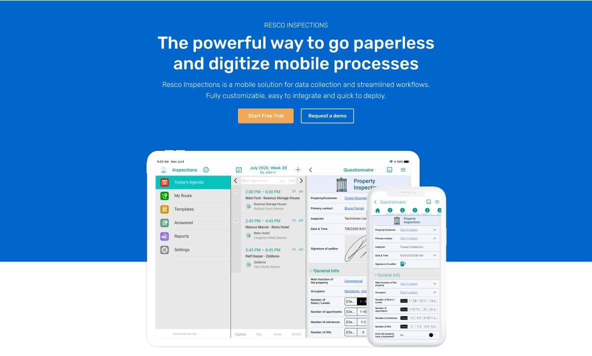
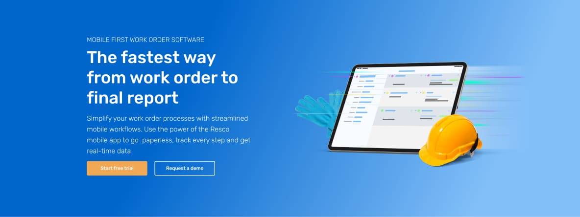
SaaS field service website redesign
Client
resco.net
Role
UX / UI Designer
Industry
Field service
Creating new web design for SaaS company developing B2B software for field service companies around the world. The goals were to unify a design, consistency between every part of the website, and to focus on better UX. I used analytical data to achieve these goals.
Results and outcomes
- Increased conversion rate on the website by 120%
- Increased number of visitors from mobile devices by 95%
- Responsive website with modern design is good looking on every device
Problem statement
Old fashioned inconsistent visuals looked unprofessional compared with the competition. The non-responsive website didn’t meet today's standards in web design.
Goals
- The increase conversion rate on websites and forms
- Professional look, responsive design and unify the visual of the whole website

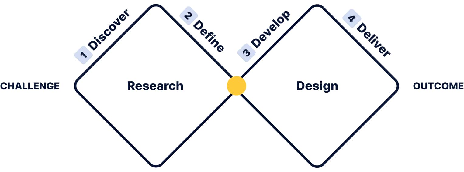
My design process
I start with research to understand users. I create personas, brainstorm, make wireframes and prototypes, test with users, and gather feedback. This ensures my designs are easy and enjoyable to use.
style guide
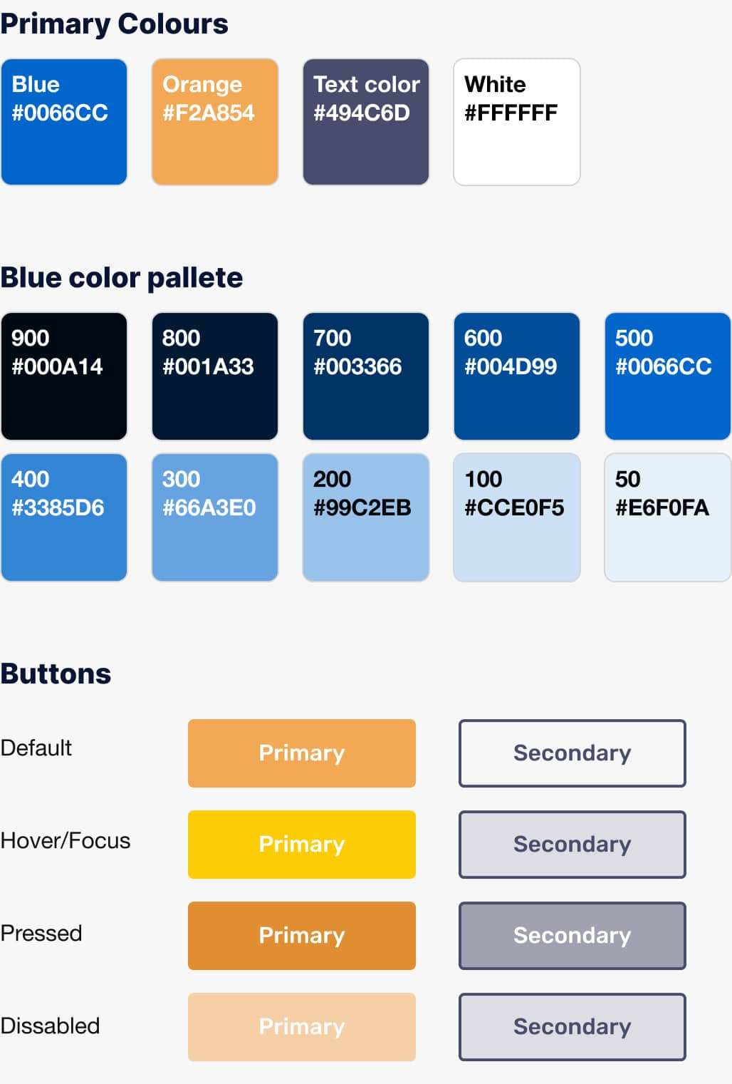
Unification of design
The first challenge was to unify current design and set up basic design rules for the future. I started with the basic style guide to unify design into the same typography, colors, and buttons into one design solution. It was the first but important step to creating a professional-looking website.

Analyze and redesign
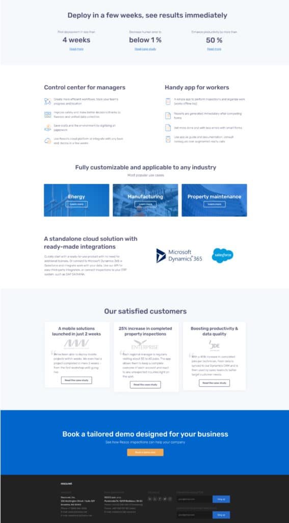
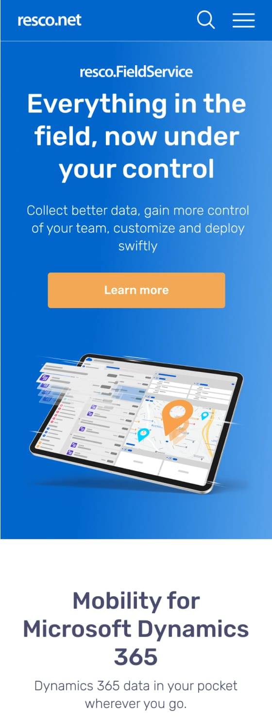
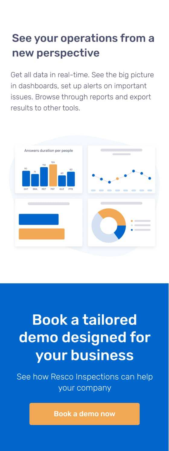
Redesign of web pages
My first step was to do research on competition in field service and then define what design patterns they are using and why. I analyzed old data on analytics and heatmaps and found online experts on B2B web design and marketing. As a team, we started learning how to compose the structure of the website to get more clients and also how to think and sell our product in the online environment in the B2B segment and to be like our top competition.
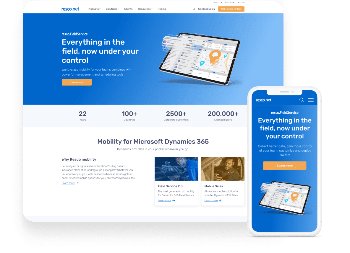
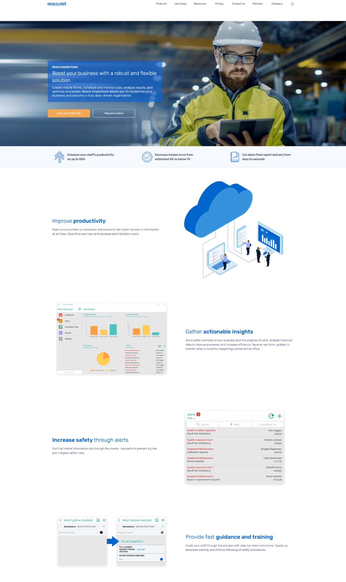
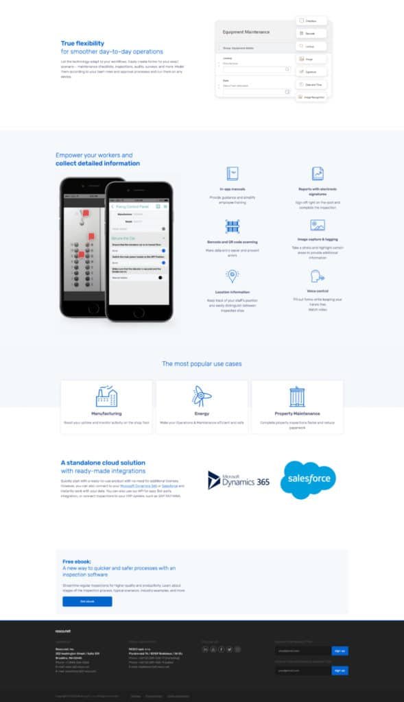
Old design
Wireframes
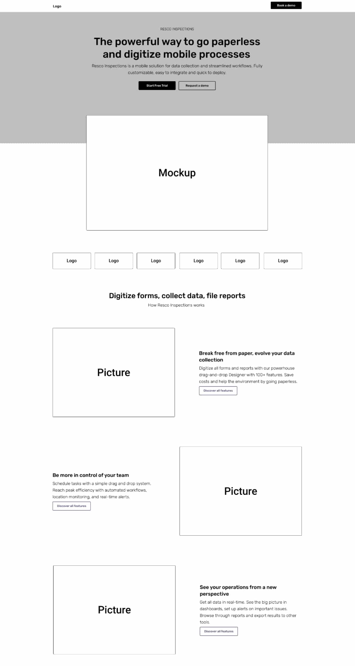
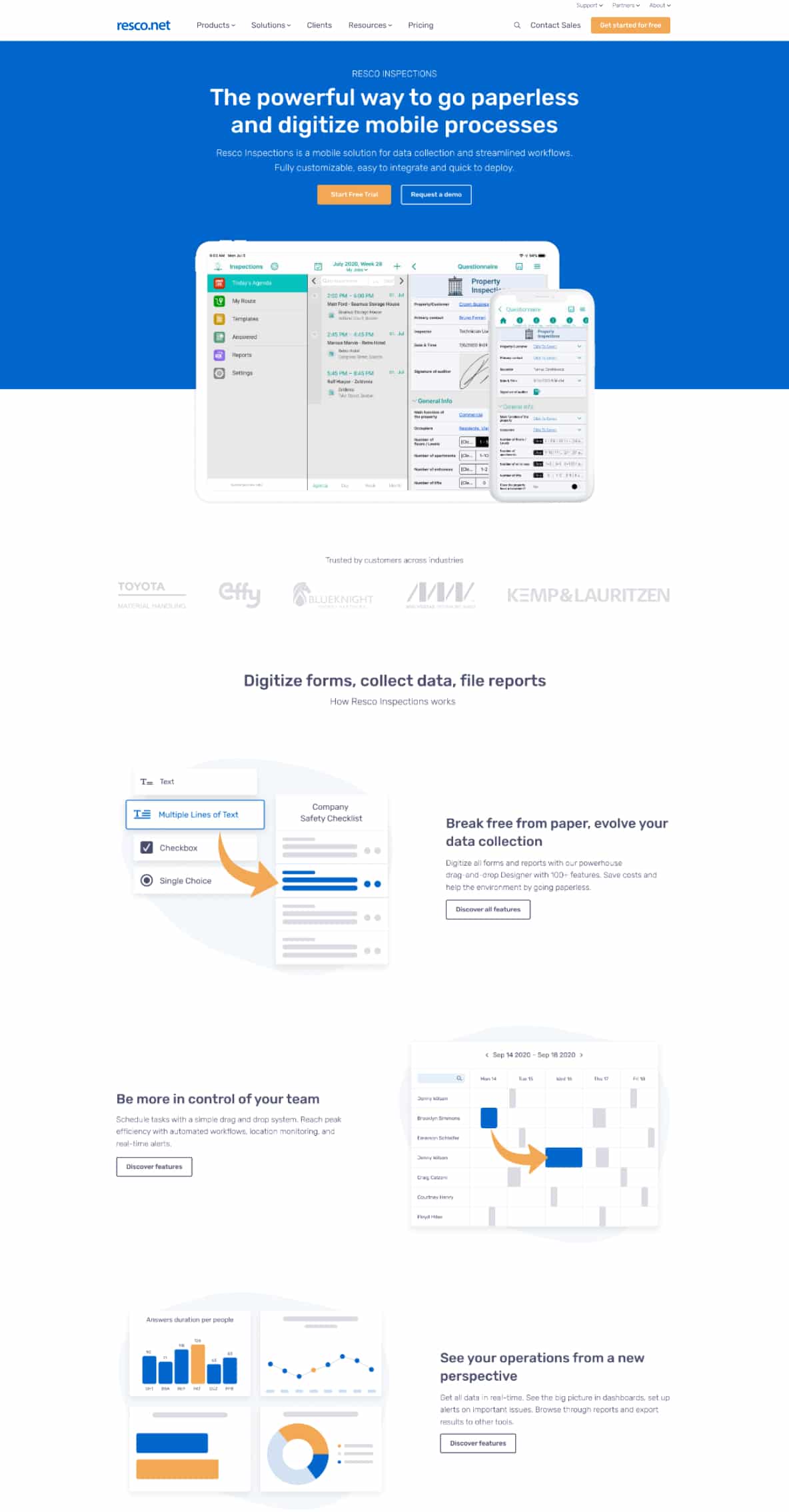
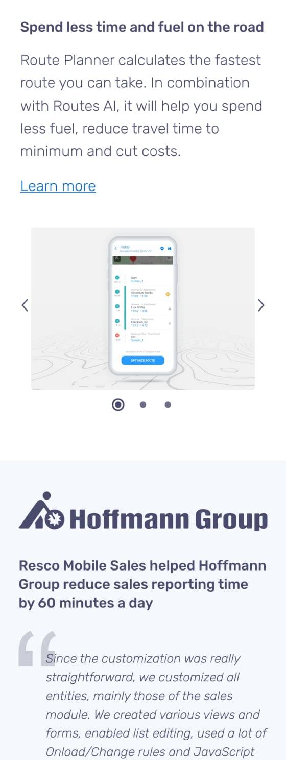
New design
Analyze and redesign
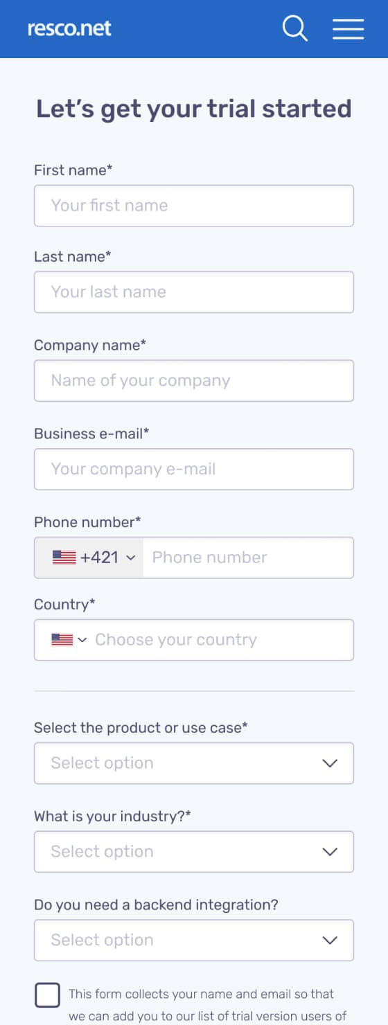
Forms and compromise
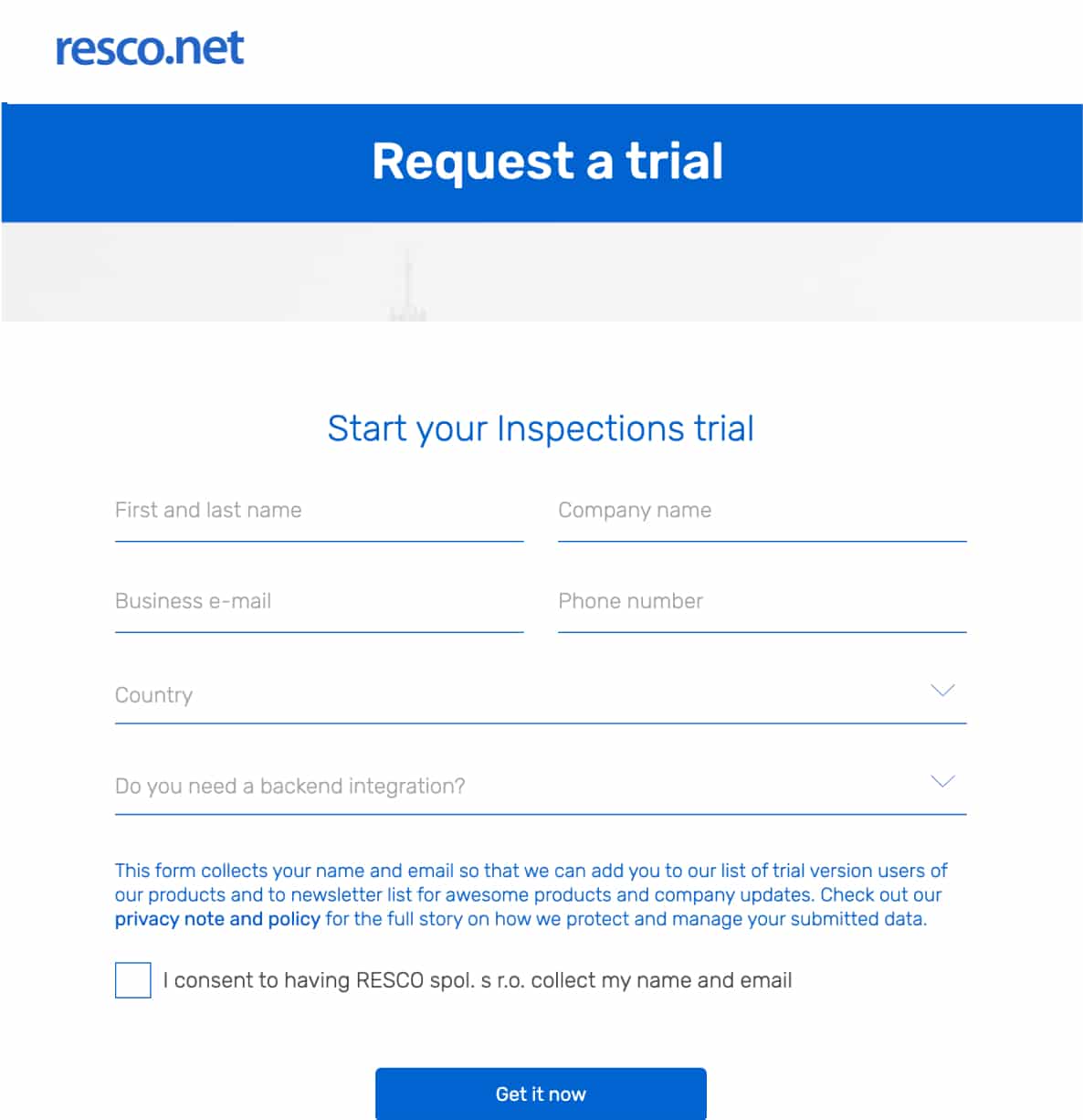
The next big challenge was to redesign forms thought that we received potential clients. I learned what is best practice in online forms and how to achieve that more users fill up our forms. Also, we had a goal to help our sales team, they needed more information about the client and his needs on the first call. So we made a compromise and created a form, that contains more inputs but is still above the fold of the screen.
Old design
New design

A/B testing
Testing components
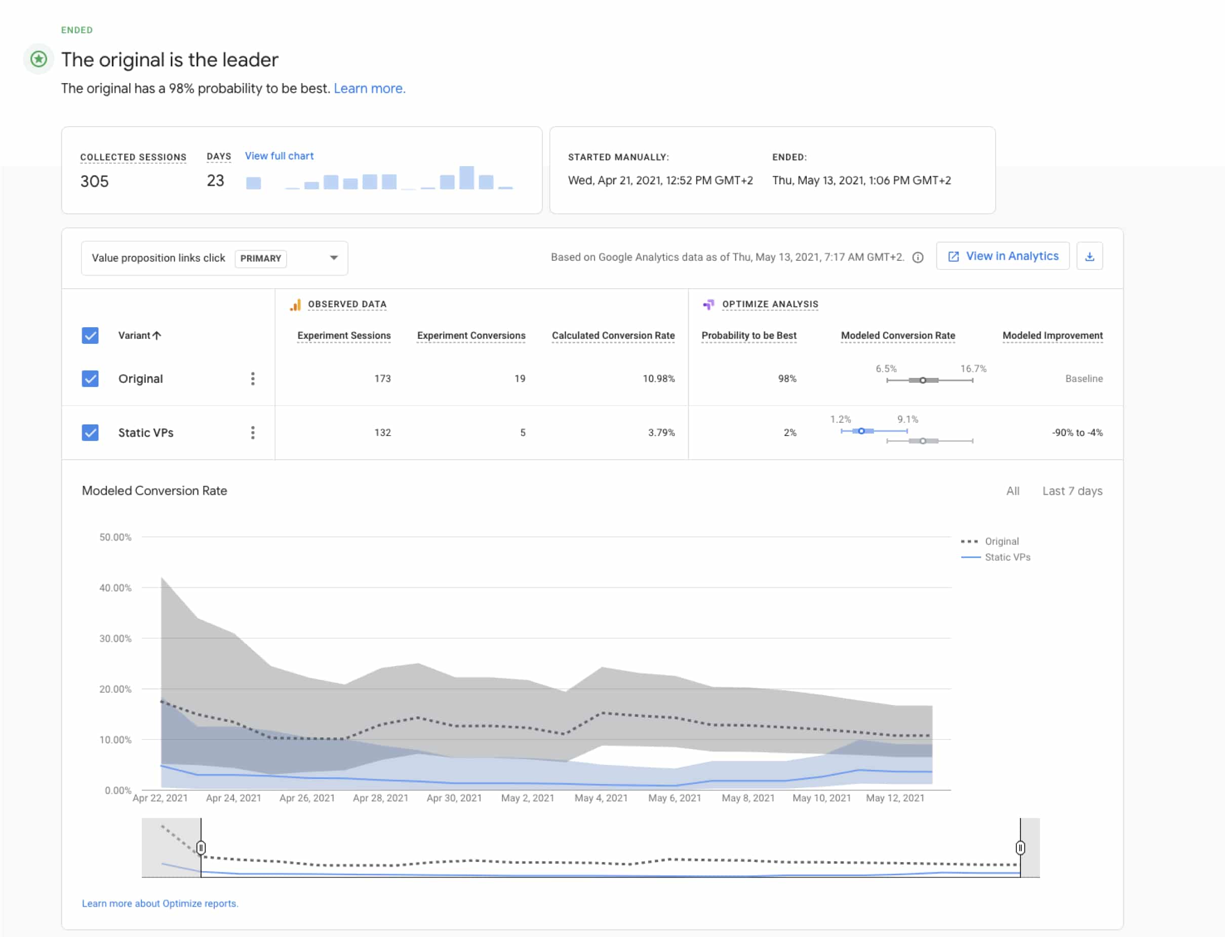
Based on the research on the competition I created hypotheses of new components that we could use to increase conversion. To confirm these hypotheses we used Google Optimize for A/B testing of components. Below is an example of how we used this tool and what results we got from it.
Original
Static VPs
Before I started work on this project (May 2020)

After 1 year of working on this project (May 2021)

Behavioral Data
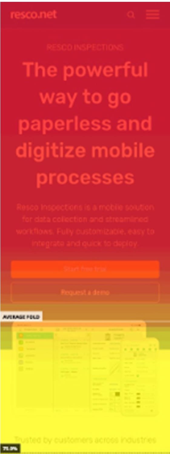
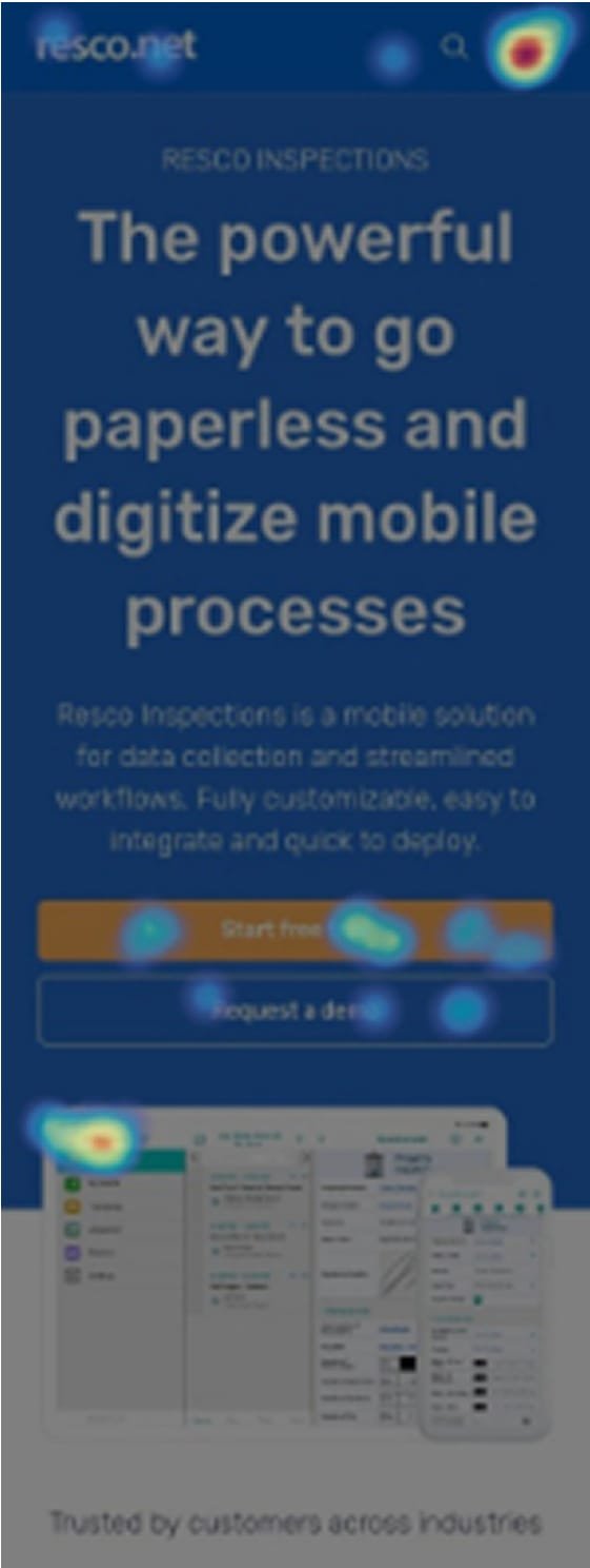
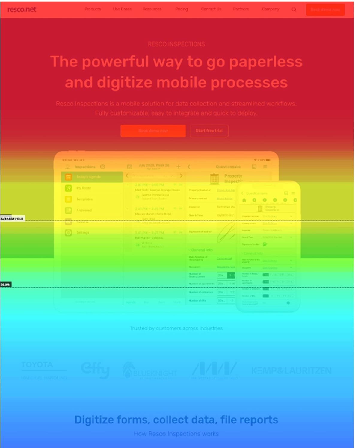
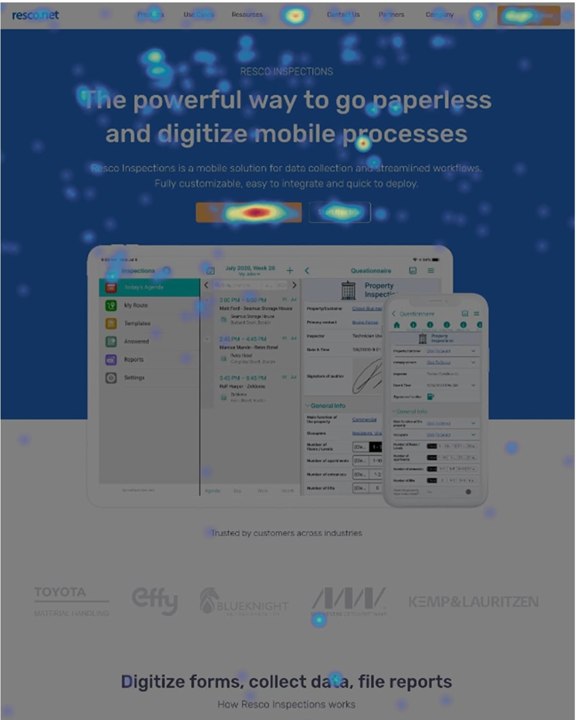
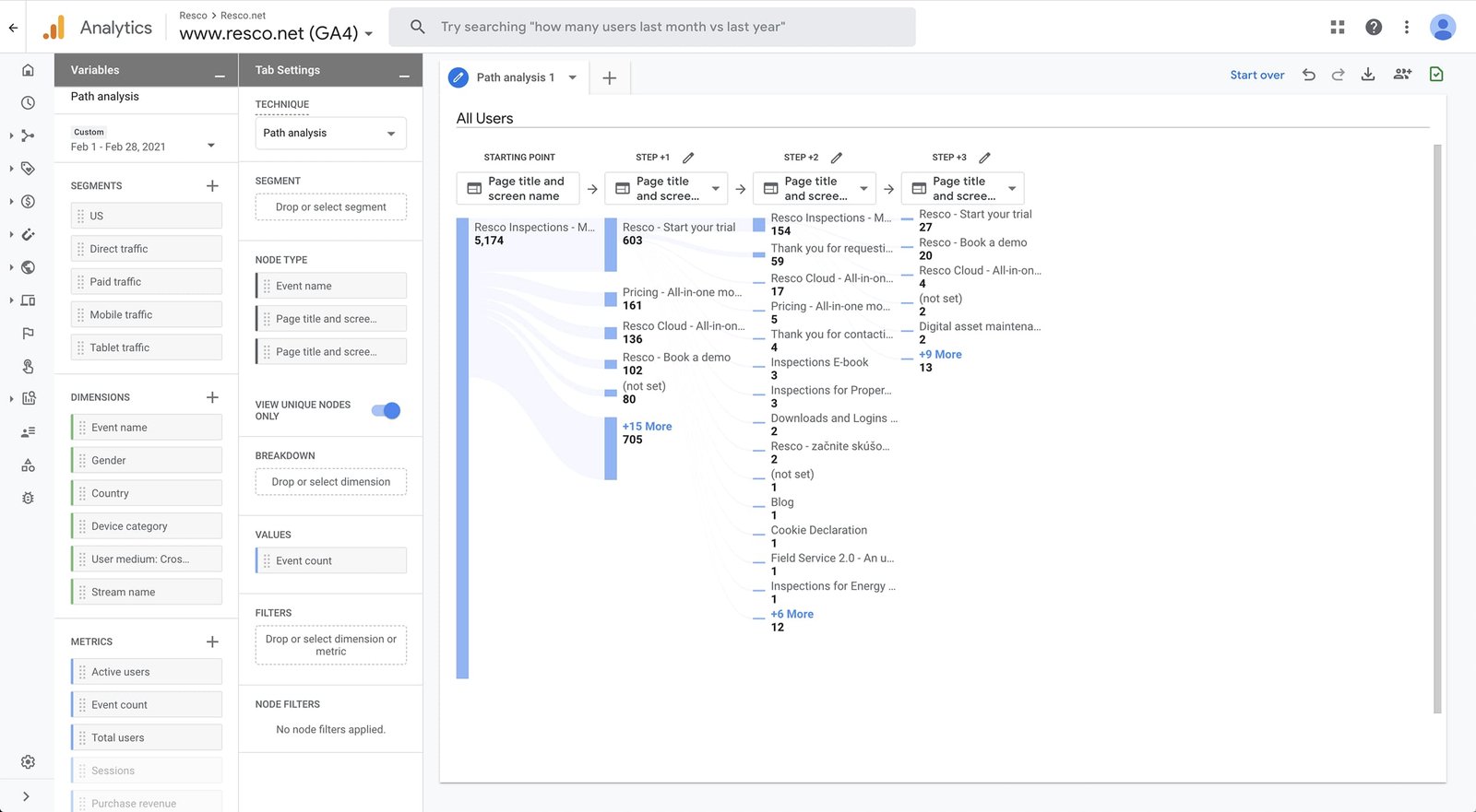
Heatmaps and User Flow Analysis
To better understand user behavior on Resco’s website, we used Hotjar heatmaps and GA4 user flows. Heatmaps showed where users clicked or got stuck, helping us spot missed CTAs and confusing elements. Session recordings revealed pain points like rage clicks and dead ends. With GA4, we tracked how users moved through key pages and identified where they dropped off. By connecting both tools, we uncovered not just what users did, but why—leading to targeted UX improvements, fewer friction points, and higher conversions.
Hotjar Mobile
Hotjar Desktop
Google Analytics 4 user flow
responsiveness
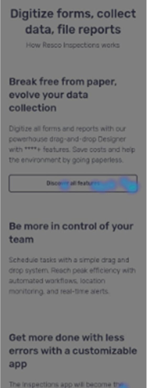
Mobile version
In my first research, 76% of users came from desktops and only 23% from mobile devices. So our design approach was to design for the desktop first and then create a responsive version of the website. After by step by step released pages with new responsive design, users from mobile devices increased to 42%.
Playing with lego
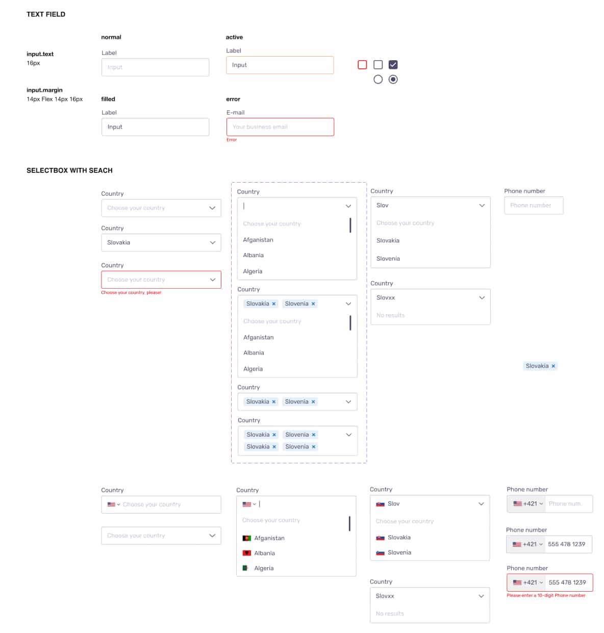
Design system
Later on in this project, we thought about we needed a system to create easily landing pages. We had some components created, I unified icons, colors, typography, and set 8px vertical grid. So I created a design system with all of these components in Figma a connected it to our project. It worked as a UI library for our website and thanks to this, we can build a website like lego in tens of minutes. It saved us a lot of time in workflow in creating landing pages.
Hero section

Secondary value proposition
Call to action


Social proof


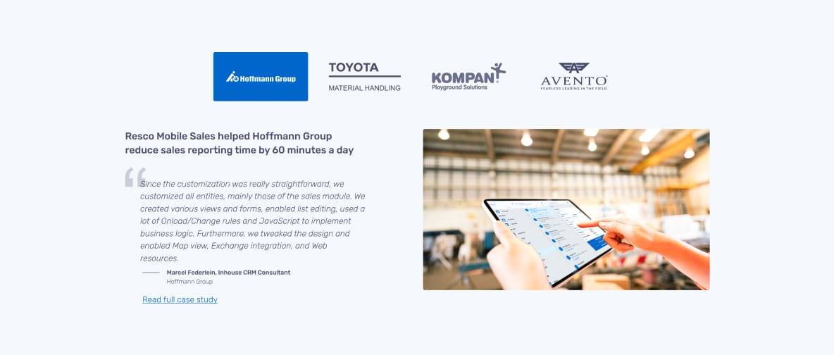
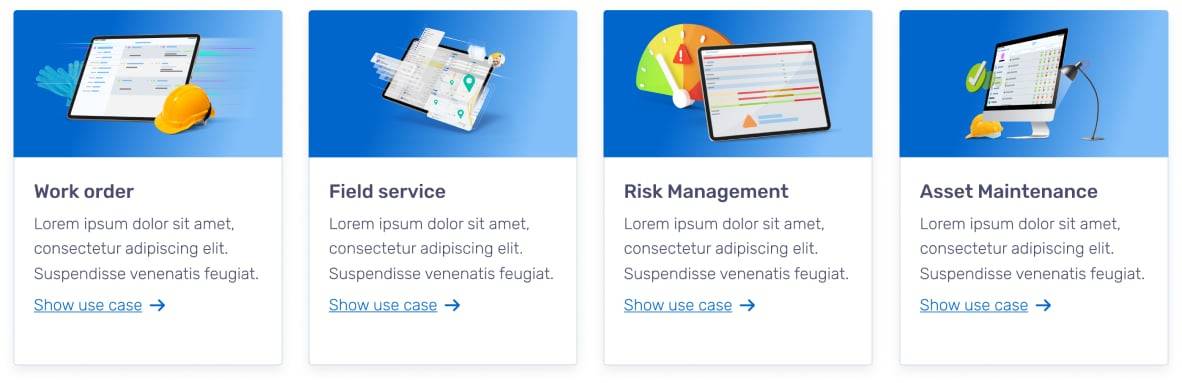
Use cases
Icons
Inputs
Motion graphics
Animations
These animations provide information about features of customizable application navigation and emphasize interactive elements. Integrating motion graphics modernizes the design and boosts clarity, helping users focus on key features and actions. These animations were created in Lottie - JSON-based animation file format and implemented into WordPress.
Easy to use - drag and drop
User friendly stats
Challenges & Conclusion
The first half of this project I really enjoyed because with a developer and web analytic we created a great team. We improved the speed of websites, conversion rate and the creating website time of the previous workflow. But it was tricky because the code was old and had a lot of exceptions. I realized this when the developer left our team and I started to take care of code after him.
Later, the project manager pushed us to more improvements, but the core of code of the WordPress website had 8 years and we needed to change the old code for a modern solution. So we could hire an agency and they could build us a modern custom solution, but for the manager, it was too expensive he wanted to repair code on the old website. Later I presented him a solution which I can build a new website with Oxygen Builder and with his requirements, but the manager ignored it.
I tried to do my best, but it was not enough, life goes on.
Drop me a line
Have a similar project in mind?
I will take you from a rough idea to a complete design
Contact me